THE PROBLEM
Have you ever been a trainer or participated in a training, a workshop, a conference, etc.?
Traditional training environment could be frustrating for both the trainer and the audience.
There are usually too many participants to give everyone the chance to share their views with the whole group, and the people brave enough to speak up don’t necessarily add the most to the conversation. Some may hold back their thoughts because they are afraid of saying something wrong. The trainer may find it hard to remember everyone’s name or what he/she said. Just to name a few here.

photo source: http://goo.gl/iYDXrW
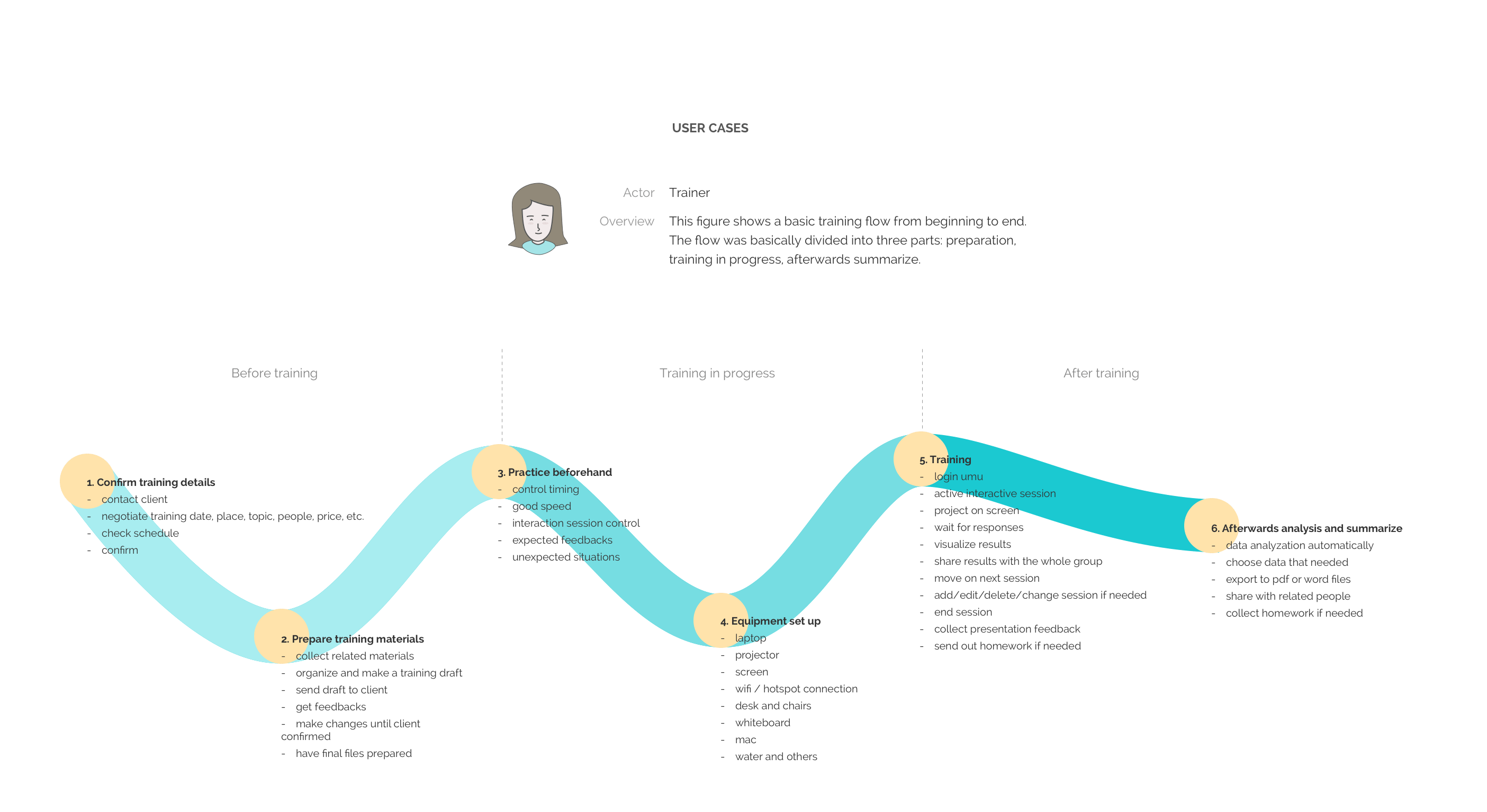
USER CASES AND SCENARIOS STUDY
Training needs to be more interactive and engaged.
The idea for UMU came to the founder, Dongshuo Li, while he attended the 2013 ATD Conference and Google I/O, instead of feeling fulfill and inspired, he felt disconnected from the speakers and other participants. He wished the speakers could better leverage the expertise of their audience and that he and others could participate more effectively. And this is why we started this project.
Having 11 years of training experience, Dongshuo knows exactly what the pain points are in a traditional training environment which makes him a perfect target user for my user case study. We talked about the training experience thoroughly from material preparation, practice, training in progress, feedbacks collection, to after action summary, everything to get a clear understand of user cases. Furthermore, I conducted several contextual inquiries by attending some trainings sessions, talked to several trainers and earned first-hand experience.
Below is a simplified user case flow map. The key scenario is training in progress. We did brainstorming together and proposed different ways to help trainers to interact with the audience.
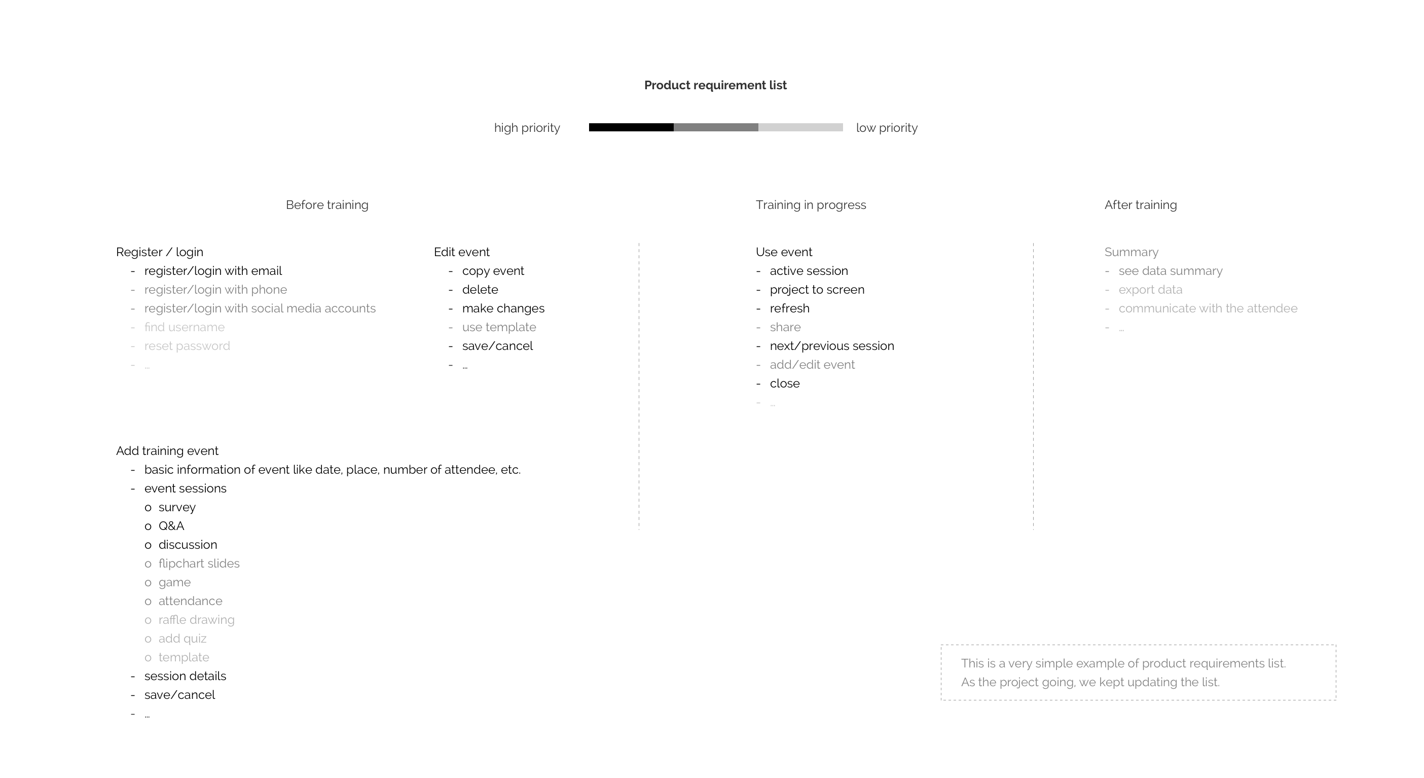
Screen and prioritize product requirements
Make simple, minimum viable product
Based on these research work, we generated a list of product requirements, categorized and prioritized them, made develop schedule. We have very limited develop resources at that time, so we tried to keep the product as minimum as possible.
We are believers in Eric Ries’s concept of Minimum Viable Product (MVP) . We are not hoping to make a full functional perfect product at the beginning, but a minimum viable product that works and could be tested.
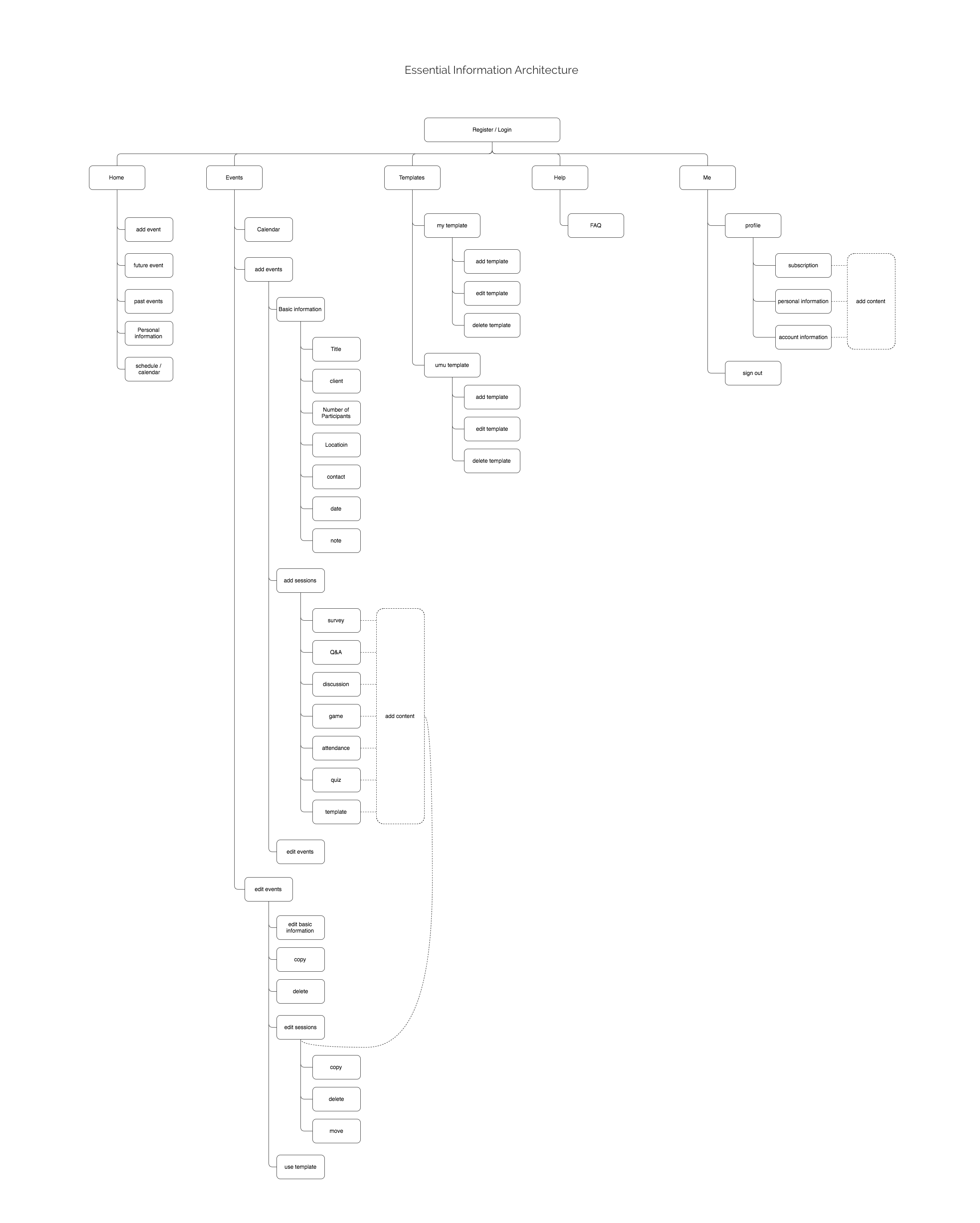
INFORMATION ARCHITECTURE
Keep it flat, organized and minimum.
After carefully screened the product requirements, we have a minimum product requirements list. This is where I begin to build information architecture. I tried to make it as simple as possible, less hierarchy, and responsive.
I categorized all the project requirements into several functional groups based on usage scenarios. And then invited trainers to conduct a closed card sorting. All the participants were asked to sort each single function into pre-defined categories. This is a very quick way to see how users understand our system.
ITERATION, WIREFRAMING
Iteration with sketches and wireframes
working in an agaile way.
After we confirmed the product requirements and typical user flows, I began to sketch the website and use Axure RP to make low-fi wireframes. I kept iterating on the design and we moved very fast, working in an agile way.